Material 3: Google’s Open Source Design Embraces a New Emotional Frontier
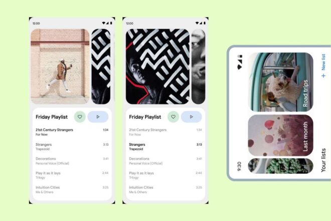
Google’s open-source design system, Material 3, is evolving to place a greater emphasis on emotion in user interfaces. This new direction aims to foster deeper connections between users and digital products by focusing on more expressive and engaging visual elements.
Tl;dr
- Material 3 leak reveals major Android design overhaul.
- Accessibility and emotional connection prioritized in interfaces.
- Developer tools to debut at Google I/O soon.
A Premature Reveal: Material 3 Comes to Light
News of Material 3, the highly anticipated evolution of Google’s Android design language, surfaced earlier than planned. An article briefly published—then hastily removed—on the tech giant’s official channels was preserved by Wayback Machine, finding its way into headlines through outlets like 9to5Google. This unintentional leak provides a first look at a transformation aiming for a more expressive and engaging experience across Android devices.
Design Grounded in Emotion—and Efficiency
What sets this new approach apart? Instead of mere cosmetic tweaks, Material 3 aspires to « connect with users on an emotional level », according to the leaked documentation. At the core of this redesign lie four pillars:
- Color: Bolder palettes draw attention to essential controls.
- Shape: Softer corners on buttons and floating bars foster friendliness.
- Size: Expanded touch targets improve accessibility.
- Animation: Micro-interactions subtly guide user actions.
This overhaul is no accident. Beginning in 2022, an extensive process involving no fewer than 46 iteration cycles and input from over 18,000 participants refined these principles. The result? Test data shows users can locate key elements up to four times faster than before—a substantial improvement, backed by eye-tracking and timed trials.
Pushing Accessibility Further
There’s a clear intent here: inclusivity stands front and center. Data indicates that even senior users achieve efficiency levels matching those of their younger counterparts under the new system. In fact, every component not only meets but often exceeds current accessibility standards, particularly regarding minimum touch target size and color contrast. It’s evident that making Android intuitive for all ages and abilities is central to this release.
The Road Ahead for Developers
So, when will these advances reach end users? During the upcoming Google I/O, a session titled « Build next-level UX with Material 3 » will dive into leveraging these design updates for greater engagement, desirability, and usability. Here—if all goes as planned—developers should gain access to early files and codebases, allowing them to experiment with these features right away.
While company representatives caution against viewing Material 3 as a « one-size-fits-all system », there’s little doubt its influence will ripple throughout future Android applications. As with many Google innovations, the question isn’t if change will come—but just how far-reaching it will be.